フォントサイズ指定は様々あり、難しい法則のものもあります。
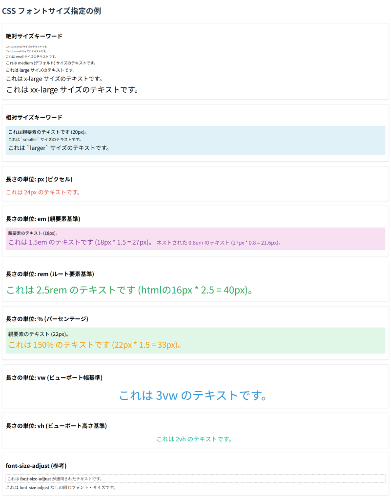
下記コードをHTMLファイルとして保存し、ブラウザで開き、様々なデバイスサイズで試すことをお勧めします。
‘vw’や’vh’、’rem’などのレスポンシブな振る舞いは理屈よりも見てみることで理解が深まります。
コード
<!DOCTYPE html>
<html lang="ja">
<head>
    <meta charset="UTF-8">
    <meta name="viewport" content="width=device-width, initial-scale=1.0">
    <title>フォントサイズ指定の例</title>
    <style>
        /* ルート要素のフォントサイズを設定 (remの基準になります) */
        html {
            font-size: 16px; /* 1rem = 16px */
        }

        h1 {
            color: #2c3e50;
            margin-bottom: 30px;
        }

        .example-box {
            background-color: #ffffff;
            border: 1px solid #ddd;
            padding: 15px;
            margin-bottom: 20px;
            border-radius: 5px;
            box-shadow: 0 2px 4px rgba(0,0,0,0.05);
        }

        p {
            margin-top: 0;
            margin-bottom: 5px;
        }

        /* --- 絶対サイズキーワード --- */
        .xx-small-text {
            font-size: xx-small;
        }
        .x-small-text {
            font-size: x-small;
        }
        .small-text {
            font-size: small;
        }
        .medium-text {
            font-size: medium; /* デフォルトサイズ */
        }
        .large-text {
            font-size: large;
        }
        .x-large-text {
            font-size: x-large;
        }
        .xx-large-text {
            font-size: xx-large;
        }

        /* --- 相対サイズキーワード --- */
        .parent-for-relative {
            font-size: 20px; /* 相対サイズの基準となる親要素 */
            background-color: #e0f2f7;
            padding: 10px;
            margin-bottom: 10px;
        }
        .smaller-text {
            font-size: smaller; /* 親要素のサイズより小さく */
        }
        .larger-text {
            font-size: larger; /* 親要素のサイズより大きく */
        }

        /* --- 長さの単位 --- */
        .px-text {
            font-size: 24px; /* 絶対ピクセル単位 */
            color: #e74c3c;
        }

        .em-parent {
            font-size: 18px; /* emの基準となる親要素 */
            background-color: #f7e0f2;
            padding: 10px;
            margin-bottom: 10px;
        }
        .em-text {
            font-size: 1.5em; /* 親要素の1.5倍 */
            color: #8e44ad;
        }
        .nested-em-text {
            font-size: 0.8em; /* 親の.em-textのサイズを基準にする */
        }

        .rem-text {
            font-size: 2.5rem; /* html要素のfont-sizeの2.5倍 (2.5 * 16px = 40px) */
            color: #27ae60;
        }

        .percent-parent {
            font-size: 22px; /* %の基準となる親要素 */
            background-color: #e0f7e7;
            padding: 10px;
            margin-bottom: 10px;
        }
        .percent-text {
            font-size: 150%; /* 親要素の150% */
            color: #f39c12;
        }

        .vw-text {
            font-size: 3vw; /* ビューポートの幅の3% */
            color: #3498db;
            text-align: center;
        }

        .vh-text {
            font-size: 2vh; /* ビューポートの高さの2% */
            color: #1abc9c;
            text-align: center;
        }

        /* font-size-adjust の例 (あまり一般的ではありません) */
        .adjust-text {
            font-family: Georgia, serif; /* Xハイトの異なるフォント */
            font-size: 18px;
            font-size-adjust: 0.5; /* Xハイトを考慮して調整 */
            border: 1px dashed #999;
            padding: 5px;
        }
    </style>
</head>
<body>
    <h1>CSS フォントサイズ指定の例</h1>

    <div class="example-box">
        <h2>絶対サイズキーワード</h2>
        <p class="xx-small-text">これは xx-small サイズのテキストです。</p>
        <p class="x-small-text">これは x-small サイズのテキストです。</p>
        <p class="small-text">これは small サイズのテキストです。</p>
        <p class="medium-text">これは medium (デフォルト) サイズのテキストです。</p>
        <p class="large-text">これは large サイズのテキストです。</p>
        <p class="x-large-text">これは x-large サイズのテキストです。</p>
        <p class="xx-large-text">これは xx-large サイズのテキストです。</p>
    </div>

    <div class="example-box">
        <h2>相対サイズキーワード</h2>
        <div class="parent-for-relative">
            <p>これは親要素のテキストです (20px)。</p>
            <p class="smaller-text">これは `smaller` サイズのテキストです。</p>
            <p class="larger-text">これは `larger` サイズのテキストです。</p>
        </div>
    </div>

    <div class="example-box">
        <h2>長さの単位: px (ピクセル)</h2>
        <p class="px-text">これは 24px のテキストです。</p>
    </div>

    <div class="example-box">
        <h2>長さの単位: em (親要素基準)</h2>
        <div class="em-parent">
            <p>親要素のテキスト (18px)。</p>
            <p class="em-text">これは 1.5em のテキストです (18px * 1.5 = 27px)。
                <span class="nested-em-text">ネストされた 0.8em のテキスト (27px * 0.8 = 21.6px)。</span>
            </p>
        </div>
    </div>

    <div class="example-box">
        <h2>長さの単位: rem (ルート要素基準)</h2>
        <p class="rem-text">これは 2.5rem のテキストです (htmlの16px * 2.5 = 40px)。</p>
    </div>

    <div class="example-box">
        <h2>長さの単位: % (パーセンテージ)</h2>
        <div class="percent-parent">
            <p>親要素のテキスト (22px)。</p>
            <p class="percent-text">これは 150% のテキストです (22px * 1.5 = 33px)。</p>
        </div>
    </div>

    <div class="example-box">
        <h2>長さの単位: vw (ビューポート幅基準)</h2>
        <p class="vw-text">これは 3vw のテキストです。</p>
    </div>

    <div class="example-box">
        <h2>長さの単位: vh (ビューポート高さ基準)</h2>
        <p class="vh-text">これは 2vh のテキストです。</p>
    </div>

    <div class="example-box">
        <h2>font-size-adjust (参考)</h2>
        <p class="adjust-text">これは font-size-adjust が適用されたテキストです。</p>
        <p style="font-family: Georgia, serif; font-size: 18px;">これは font-size-adjust なしの同じフォント・サイズです。</p>
    </div>
</body>
</html>
プレビュー